Thursday, August 16, 2012

Unit 2 Activity 4

Photo by unknown
Photo by Klaus Neuner                                                        


                                                                                                                                              Balance in Photography                                                Imbalance in Photography
The photographers of these two pictures probably intended to balance them with the subjects. The picture on the left is balanced because the chair is off to the left and the window is off to the right. The picture on the right is imbalanced because the flower is basically in the center which isn't a correctly balanced picture.
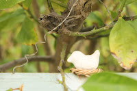


The pictures that I took on the left are imbalanced photos because the subjects are off center and have nothing else surrounding them. The pictures that I took on the right are balanced photos because the subjects are off center but the backgrounds compliment the foregrounds so they work. 

Wednesday, August 15, 2012

Unit 2 Activity 3

Rule of Thirds                                                                                             Not Rule of Thirds

Photo by Peter Vidani
Photo by unknown
                                                       

Photo by unknown
Photo by unknown
                                                        
The pictures on the left definitely show rule of thirds while the pictures on the right don't show rule of thirds. The subjects in the two pictures on the left are aligned correctly for the rule of thirds technique. But the subjects in the pictures on the right aren't aligned correctly because they are more centered so they don't show the rule of thirds technique.


Unit 2 Activity 2

Tuesday, August 14, 2012

Unit 2 Activity 1


                                                              Photo by Craig Jones
Photo by Busser Philippe


These two photos both show how the photographer got up close to the animals and focused only on the animals and not the backgrounds. The picture of the bear was taken farther back when compared to the picture of the lynx. Both backgrounds are simple and not distracting whatsoever from the focal point. The focal points in the pictures are the bear and the lynx. These photos fill the frame and show the significance of the subjects.